Table of Contents
The Table of Contents component displays a list of clickable headings corresponding to the sections on the page which allows users to navigate directly to different sections on the page.
On This Page:
Usage
The Table of Contents (TOC) component should only be used on lengthy pages that contain multiple headers/sections. Historically, some pages have used an accordion to organize what could be headers and text in an effort to make the page easier to read and navigate. The TOC is an excellent alternative in these cases.
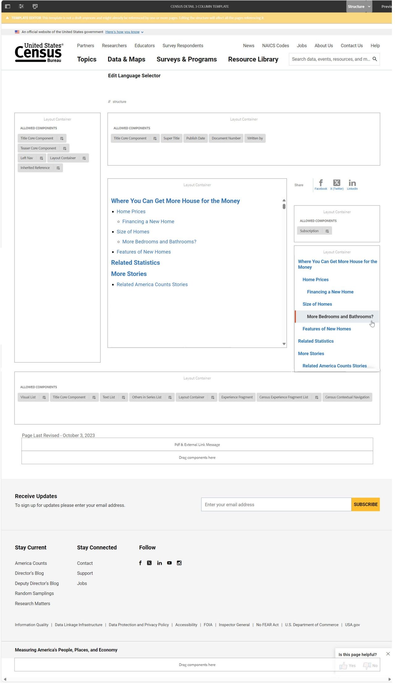
Content authors can add the TOC component to the main page body or in the right rail. The TOC list is automatically generated by using the headings (h1, h2, etc.) on the page and building a clickable list of the headings. If a user clicks on a heading in the TOC, they are taken to that section of the page.
Currently, if the TOC is placed in the main body of the page, all of the headings will be listed and content authors will not be allowed to specify which headings are displayed. If the TOC is placed in the right rail, content authors can specify the heading levels to be displayed.
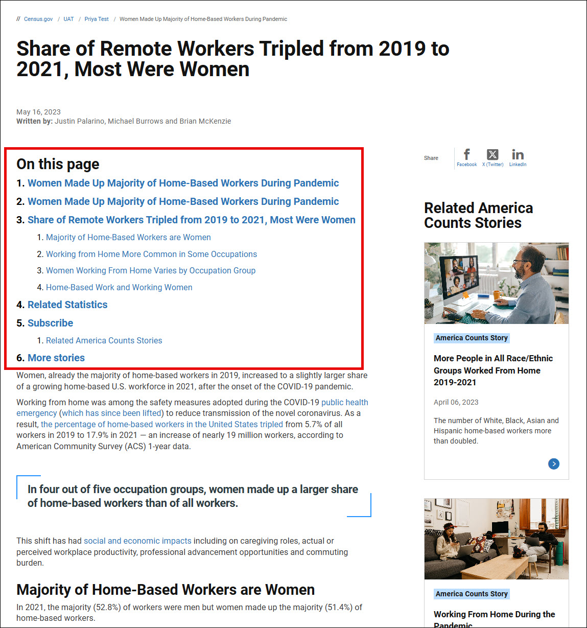
In the main body, the TOC displays as a bulleted list without a title.
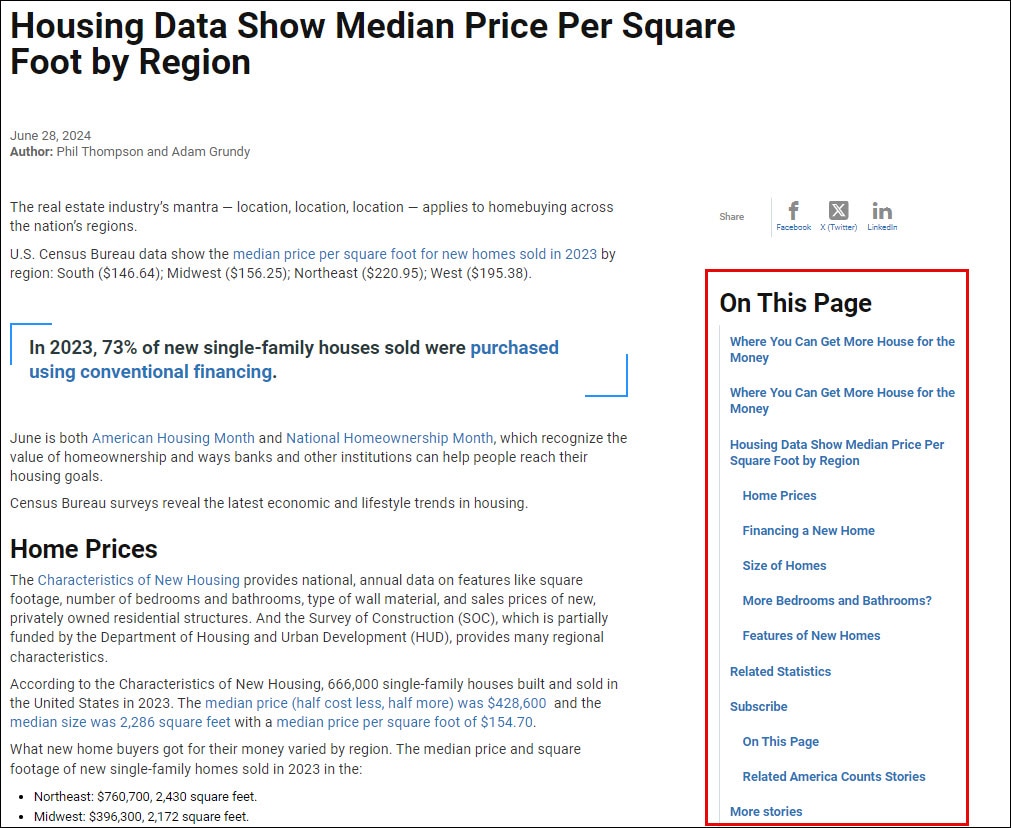
In the right rail, the TOC displays without bullets and has "On This Page" as the title.
Fun Fact:
The Table of Contents is sticky!
When placed in the right rail, the Table of Contents will move up or down with the page as the user scrolls.
Examples
Table of Contents in the main section of the page:

Table of Contents in the right rail:

Examples by Template
Census 3 Column

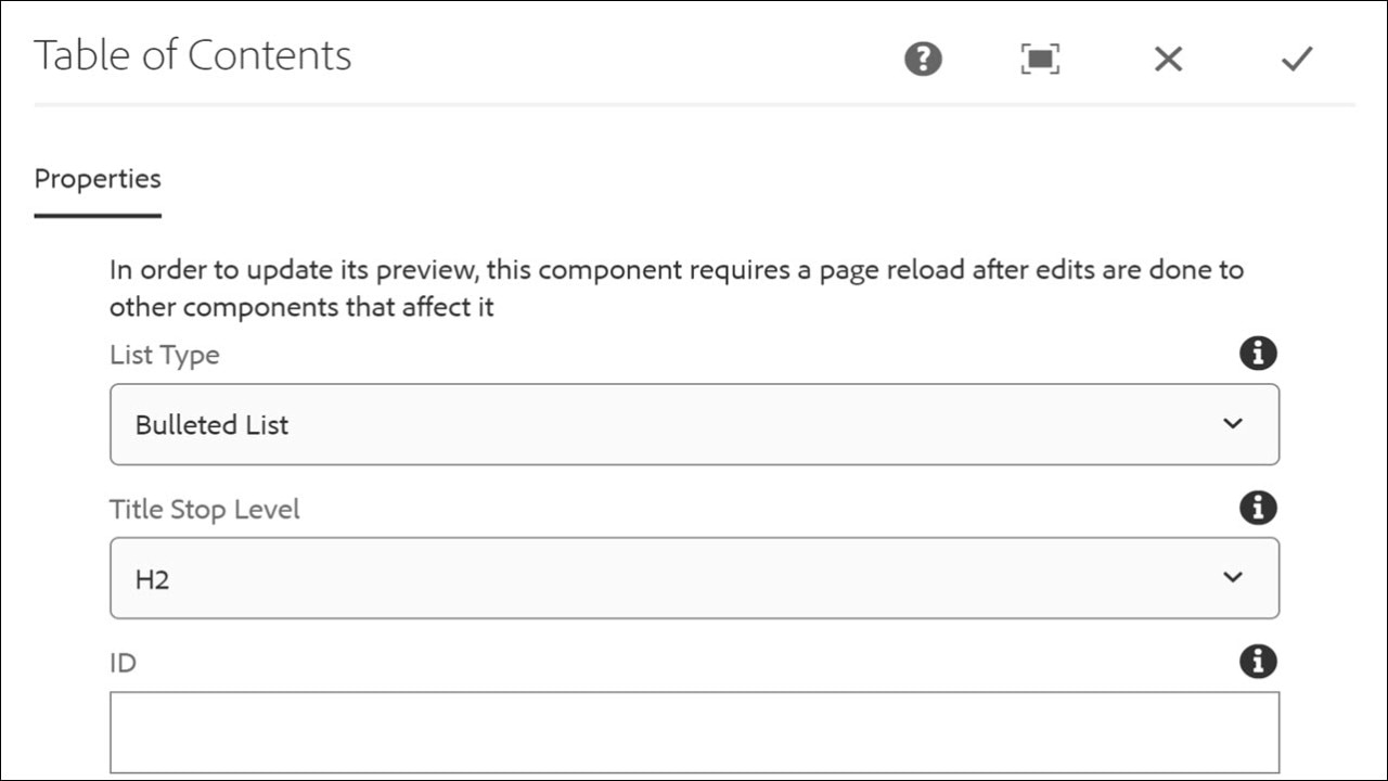
Configure Dialog
The configure dialog allows the content author to define list type, heading levels, and ID for the right rail only.
Tab: Properties
- List Type - The content author can select either a Bulleted List or a Numbered List to display the Table of Contents.
- Title Stop Level - For the right rail, the content author can specify which heading levels will be included in the Table of Contents.
- ID - If left blank, a unique ID is automatically generated. This option can allow the user to control the unique identifier of the component in the HTML and in the Data Layer.
