Headline Feature
The Headline Feature component is an extended OOTB full-width component that holds text and visually sections off the page with a solid background or an image background.
On This Page:
Purpose
The Headline Feature component allows content authors to feature text and an image on America Counts story pages. The text portion functions as a page title, so the title component can be used as the article title. The image portion of the component should be relevant to the article.
Configure Dialog
Links & Actions
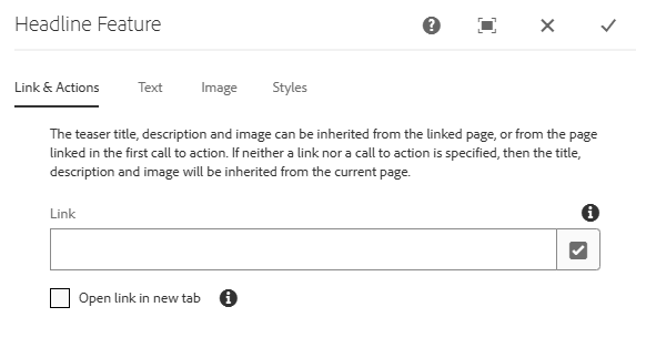
Link: Authors can insert a link to the featured page by inputing the page URL directly or by selecting the checkmark icon to open the selection dialog and browsing for the page.
Open link in new tab: If checked, the linked page will open in a new tab.
Text
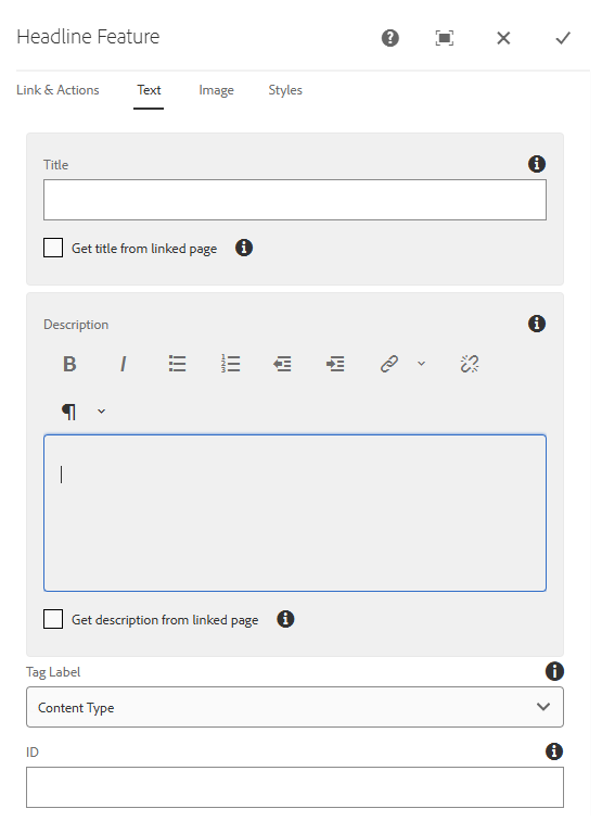
Title: Check the 'Get title from linked page' checkbox below the field to pull the title from the page linked under the Link & Actions tab (link must point to page in AEM). Manually entering text will override the linked page title.
Description: Check the 'Get description from linked page' checkbox below the field to pull the teaser text from the page linked under the Link & Actions tab (link must point to page in AEM). Manually entering text will override the linked page teaser text.
Tag Label: Change which tag label shows in the component. This label can only be seen on the Single Featured Page and Homepage (ONLY) Feature styles.
- Available options:
- Content Type
- Topics
- Programs
ID: Apply an HTML ID attribute to the component to be used as an anchor link.
Image
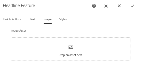
Image Asset: Insert an image by dragging and dropping the asset from the Side Panel. The image must already be uploaded to the DAM.
Styles
There are three available styles for the Headline Feature component:
- Single Featured Page: Used to feature a single page and can show the tag label, unlike the other styles. Works best on the Census Detail 2 Column Left Template or Census Promotional Page. It can be used on the Census Detail 3 Column Template, but longer titles and text may be cut off.
- AC Featured Page: Primarily used on the Census Article 2 Column Right Template for America Counts stories. This style spans the full width of the page, so it should only be used for those cases or on promotional pages where the templates span the full width of the page.
- Homepage (ONLY) Feature: Only to be used on the Census Homepage.
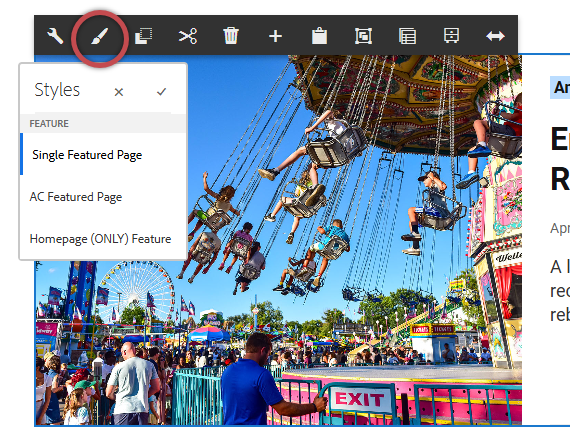
Single Featured Page
AC Featured Page
Homepage (ONLY) Feature
Live Examples
View on the public site:
Developer Resources
Expand the section below to see the Headline Feature component's HTML output.
