Population of the United States – 1790 to 1800
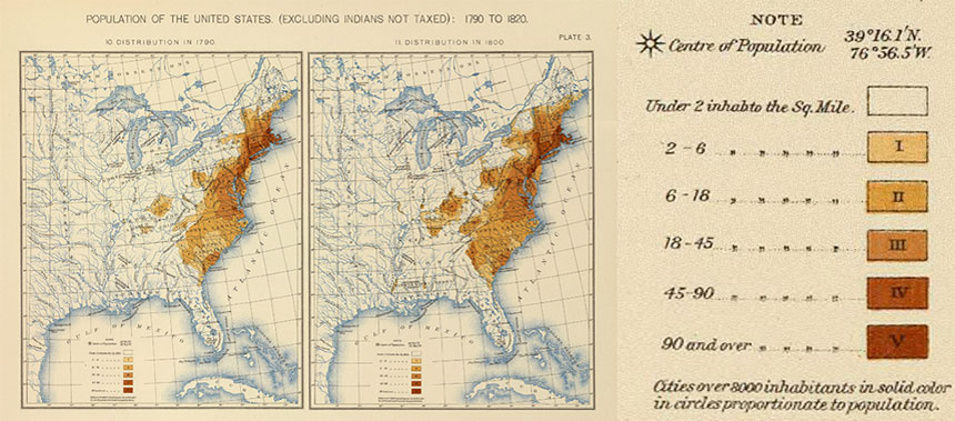
This map displays the population density of the United States according to the 1790 and 1800 Censuses. It is a subset of larger map historic map that also displays the U.S. population density based on the 1810 and 1820 Censuses. This map is an example of a choropleth map; the darker shaded regions represent higher population densities while the lighter shaded regions represent lower population densities.
Related Activity
Population Profile of Our New Nation: A Comparison of the 1790 and 1800 Censuses
In this activity, students will refer to the 1790 and 1800 Censuses to compare the total population with the population of enslaved people, drawing conclusions from the data.
Page Last Revised - March 31, 2026